React Native Push Down Alert

A customizable pushdown alert component for React Native applications. It provides a simple way to display success, error, and warning notifications with a unique pushdown animation that pushes down the entire content of app to show the notification.
Features
- Display success, error, and warning notifications.
- Customizable alert appearance and behavior.
- Queue or cancel current alerts based on configuration.
- Supports custom icons and styles.
Installation
To install the library, use npm or yarn:
npm install react-native-pushdown-alert
# or
yarn add react-native-pushdown-alert
Usage
Here's a basic example of how to use the react-native-pushdown-alert in your application:
import {
PushDownAlertPortal,
showNotification,
} from "react-native-pushdown-alert";
import { View, Button } from "react-native";
const MyApp = () => {
return (
<View>
<Button
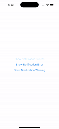
title="Show Notification Success"
onPress={() => {
showNotification({
type: "success",
message: "Hi a message body",
title: "Hello World",
});
}}
/>
</View>
);
};
const config = {};
const App = () => {
return (
<PushDownAlertPortal config={config}>
<MyApp />
</PushDownAlertPortal>
);
};Step-by-Step Guide
-
Import the Components : Import PushDownAlertPortal and showNotification from the library.
import { PushDownAlertPortal } from "react-native-pushdown-alert"; -
Place the Portal : Place the PushDownAlertPortal component as high as possible in your component tree. This ensures that alerts can be displayed over all other components.
const App = () => { return ( <PushDownAlertPortal config={config}> {...rest of your app} </PushDownAlertPortal> ); }; -
Trigger Notifications : Use the showNotification function anywhere in your app to trigger alerts. You can call this function in response to events, such as button presses or API responses.
[!NOTE]
If a notification is already showing, subsequentshowNotificationcalls will be queued based your chosen queuing behavior.
showNotification({
  type: "success",
  message: "Hi a message body",
  title: "Hello World",
});
API
showNotification
- Parameters :
type: Type of the alert (success,error,warning).title: Title of the alert.message: Message body of the alert.
PushDownAlertPortal
- Props :
config: Configuration object for customizing alert behavior and appearance.
Configuration
You can customize the alert behavior and appearance by passing a configuration object to the PushDownAlertPortal component. Here are some of the available options:
alertDisplayDuration: Duration for which the alert is displayed.openAnimationDuration: Duration of the open animation.closeAnimationDuration: Duration of the close animation.alertQueueBehaviour: Determines how alerts are handled when a notification is already showing. Options include:queue: New alerts are added to a queue and displayed sequentially.cancelCurrent: The current alert is dismissed, and the new alert is displayed immediately.
titleTextStyle: Custom style for the alert title.messageTextStyle: Custom style for the alert message.successConfig,errorConfig,warningConfig: Custom configurations for each alert type, including icons and background colors.
Sample Configuration
Here's an example of how you can customize the alert configurations:
const config = {
  alertDisplayDuration: 4000,
  openAnimationDuration: 500,
  closeAnimationDuration: 500,
  alertQueueBehaviour: "queue",
  titleTextStyle: { fontSize: 18, fontWeight: "bold", color: "#fff" },
  messageTextStyle: { fontSize: 16, color: "#fff" },
  successConfig: {
    icon: <CustomSuccessIcon />, // Replace with your custom icon component
    backgroundColor: "#4CAF50", // Green background for success alerts
  },
  errorConfig: {
    icon: <CustomErrorIcon />, // Replace with your custom icon component
    backgroundColor: "#F44336", // Red background for error alerts
  },
  warningConfig: {
    icon: <CustomWarningIcon />, // Replace with your custom icon component
    backgroundColor: "#FFC107", // Yellow background for warning alerts
  },
};
Contributing
See the contributing guide to learn how to contribute to the repository and the development workflow.
License
MIT